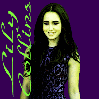
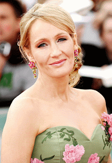
This is my before and after picture for my contrast project in graphic design. In the two pictures of Lily Collins I used Curve, Level,and Hue/Saturation tools for my project. I change the picture to a point that instead of tough and rough, it is fine and retro. The text that I choose in the picture was 'Park Avenue BT' because of how sophisticated and lovely it looked on the picture. The hardest part for me in the project was not the Curve or the Hue/Saturation, but just getting rid of her surroundings. I mean come on, do you know how many times I deleted bits and pieces of her arm and head? It makes me want to do the same to me in real life.
Jenn
Jenn


